# Tabs and panels
Available from v2.10
Once your Avo resources reach a certain level of complexity you feel the need to better organize them into groups. You can already use the heading to separate the fields inside a panel but maybe you'd like to do more.
# Panels

First we should talk a bit about panels. They are the backbone of Avo's display infrastructure. Most of the information that's on display is wrapped inside a panel. They help to give Avo that uniform design on every page. They are available as a view component too for custom tools and you can make your own pages using the same component.
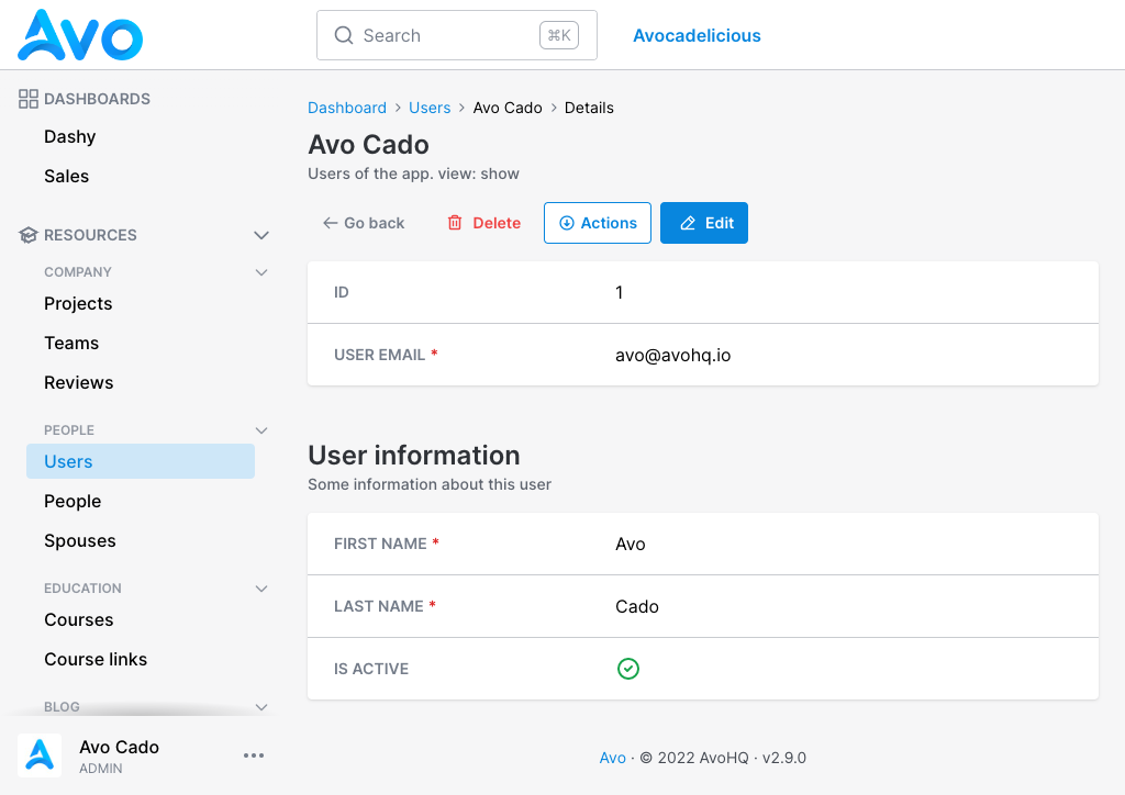
When using the fields DSL for resources, all fields declared in the root will be grouped into a "main" panel, but you can add your own panels.
class UserResource < Avo::BaseResource
  field :id, as: :id, link_to_resource: true
  field :email, as: :text, name: "User Email", required: true

  panel name: "User information", description: "Some information about this user" do
    field :first_name, as: :text, required: true, placeholder: "John"
    field :last_name, as: :text, required: true, placeholder: "Doe"
    field :active, as: :boolean, name: "Is active", show_on: :show
  end
end

You can customize the panel name and panel description.
# Index view fields
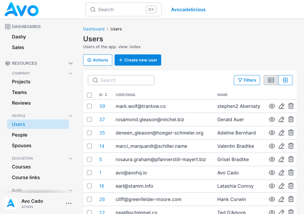
By default only the fields declared in the root will be visible on the Index view.
class UserResource < Avo::BaseResource
  # Only these fields will be visible on the `Index` view
  field :id, as: :id, link_to_resource: true
  field :email, as: :text, name: "User Email", required: true
  field :name, as: :text, only_on: :index do |model|
    "#{model.first_name} #{model.last_name}"
  end

  # These fields will be hidden on the `Index` view
  panel name: "User information", description: "Some information about this user" do
    field :first_name, as: :text, required: true, placeholder: "John"
    field :last_name, as: :text, required: true, placeholder: "Doe"
    field :active, as: :boolean, name: "Is active", show_on: :show
  end
end

# Tabs
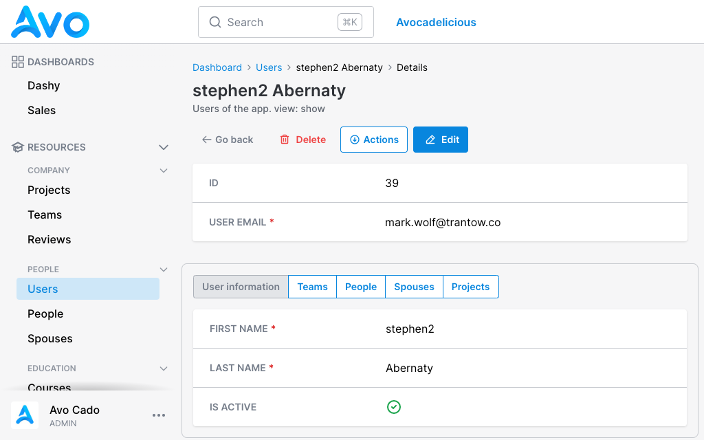
Tabs are a new layer of abstraction over panels. They enable you to group panels and tools together under a single pavilion and toggle between them.
class UserResource < Avo::BaseResource
  field :id, as: :id, link_to_resource: true
  field :email, as: :text, name: "User Email", required: true

  tabs do
    tab "User information", description: "Some information about this user" do
      panel do
        field :first_name, as: :text, required: true, placeholder: "John"
        field :last_name, as: :text, required: true, placeholder: "Doe"
        field :active, as: :boolean, name: "Is active", show_on: :show
      end
    end

    field :teams, as: :has_and_belongs_to_many
    field :people, as: :has_many
    field :spouses, as: :has_many
    field :projects, as: :has_and_belongs_to_many
  end
end

To use tabs you open a tabs group block using tabs. Next you add your tab block where you add fields and panels like you're used to on resource root. Most fields like text, number, gravatar, date, etc. need to be placed in a panel. The has_one, has_many, and has_and_belongs_to_many have their own panels and they don't require a panel or a tab.
The tab name is mandatory is what will be displayed on the tab switcher. The tab description is what will be displayed in the tooltip on hover.

# Tabs on Show view
Tabs have more than an aesthetic function. They have a performance function too. On the Show page, if you have a lot of has_many type of fields or tools, they won't load right away making it a bit more lightweight for your Rails app. They will lazy-load only when they are displayed.
# Tabs on Edit view
On Edit, all visibility rules still apply, meaning that has_* fields will be hidden by default. You can enable them by adding show_on: :edit. All other fields will be loaded and hidden on page load. This way when you submit a form, if you have validation rules in place requiring a field that's in a hidden tab, it will actually be present on the page on submit-time.
