# Dashboards
There comes the point in your app's life when you need to display the data in an aggregated form like a metric or chart. That's what Avo's Dashboards are all about.
# Generate a dashboard
Run bin/rails g avo:dashboard my_dashboard to get a shiny new dashboard.
class MyDashboard < Avo::Dashboards::BaseDashboard
  self.id = 'my_dashboard'
  self.name = 'Dashy'
  self.description = 'The first dashbaord'
  self.grid_cols = 3

  card ExampleMetric
  card ExampleAreaChart
  card ExampleScatterChart
  card PercentDone
  card AmountRaised
  card ExampleLineChart
  card ExampleColumnChart
  card ExamplePieChart
  card ExampleBarChart
  divider label: "Custom partials"
  card ExampleCustomPartial
  card MapCard
end
# Settings
Each dashboard is organized in a file. It holds information about itself like the id, name, description, and how many columns its grid has.
The id field has to be unique. The name is what the user sees in big letters on top of the page, and the description is some text you pass to give the user more details regarding the dashboard.
Using the ' grid_cols ' parameter, you may organize the cards in a grid with 3, 4, 5, or 6 columns using the grid_cols parameter. The default is 3.
# Cards
All cards have a few base settings and a few custom ones.
# Base settings
All cards have some standard settings like id, which must be unique, label and description. The label will be the title of your card, and description will show a tiny question mark icon on the bottom right with a tooltip with that description.
Each card has its own cols and rows settings to control the width and height of the card inside the dashboard grid. They can have values from 1 to 6.
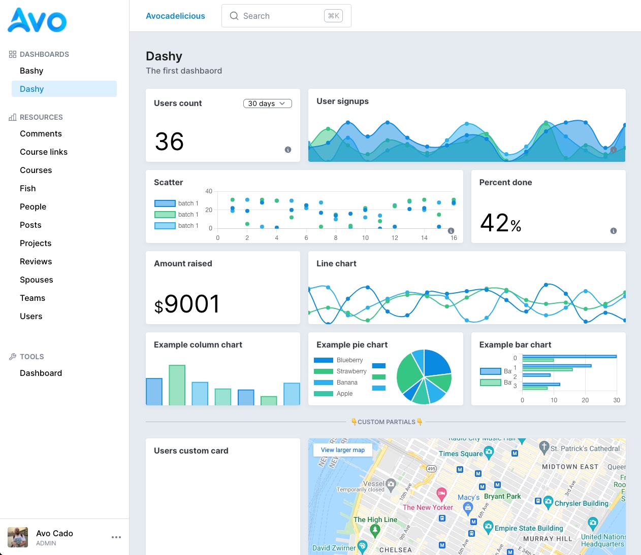
class UsersMetric < Avo::Dashboards::MetricCard
  self.id = 'users_metric'
  self.label = 'Users count'
  self.description = 'Users description'
  self.cols = 1
  self.rows = 1
  self.display_header = true
end
# Control the aggregation using ranges
You may also want to give the user the ability to query data in different ranges. Using the ranges attribute, you can control what's passed in the dropdown. The array passed here will be parsed and displayed on the card. All integers are transformed to days, and other string variables will be passed as they are.
You can also set a default range using the initial_range attribute.
class UsersMetric < Avo::Dashboards::MetricCard
  self.id = 'users_metric'
  self.label = 'Users count'
  self.initial_range = 30
  self.ranges = {
    "7 days": 7,
    "30 days": 30,
    "60 days": 60,
    "365 days": 365,
    Today: "TODAY",
    "Month to date": "MTD",
    "Quarter to date": "QTD",
    "Year to date": "YTD",
    All: "ALL"
  }
end
# Keep the data fresh
If this dashboard is something that you keep on the big screen, you need to keep the data fresh at all times. That's easy using refresh_every. You pass it the number of seconds you need to be refreshed in and forget about it. Avo will do it for you.
class UsersMetric < Avo::Dashboards::MetricCard
  self.id = 'users_metric'
  self.refresh_every = 10.minutes
end
# Hide the header
In cases where you need to embed some content that should fill the whole card (like a map, for example), you can choose to hide the label and ranges dropdown.
class UsersMetric < Avo::Dashboards::MetricCard
  self.id = 'users_metric'
  self.display_header = false
end
# Override card options from the dashboard
We found ourselves in the position to add a few cards that were actually the same card but with a slight difference. Ex: Have one Users count card and another Active users count card. They both count users, but the latter has an active: true condition applied.
Before, we'd have to duplicate that card and make that slight modification to the query method but end up with duplicated boilerplate code.
For those scenarios, we created the options... card option. It allows you to essentially send arbitrary options to the card from the parent like so.
class Dashy < Avo::Dashboards::BaseDashboard
  self.id = "dashy"
  self.name = "Dashy"

  card UsersCount
  card UsersCount, options: {
    active_users: true
  }
end
Now we can pick up that option in the card and update the query accordingly.
class UsersCount < Avo::Dashboards::MetricCard
  self.id = "users_metric"
  self.label = "Users count"

  # You have access to context, params, range, current dashboard, and current card
  def query
    scope = User

    if options[:active_users].present?
      scope = scope.active
    end

    result scope.count
  end
end
This gives you an extra layer of control without code duplication and the best developer experience.
# Control the base settings from the parent
Evidently, you don't want to show the same label, description, and other details for that second card from the first card;. You can control the label, description, cols, rows, and refresh_every options from the parent declaration.
class Dashy < Avo::Dashboards::BaseDashboard
  self.id = "dashy"
  self.name = "Dashy"

  card UsersCount
  card UsersCount,
    label: "Active users",
    description: "Active users count",
    cols: 2,
    rows: 2,
    refresh_every: 2.minutes,
    options: {
      active_users: true
    }
end
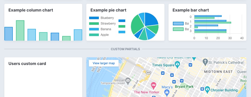
# Card types
There are three types of cards you can add to your dashboard: metric, chartkick, and partial.
# Metric card
The metric card is your friend when you only need to display a simple big number on your dashboard. To generate one run bin/rails g avo:card:metric users_metric.
# Calculate results
To calculate your result, you may use the query method. After you run your query, use the result method to store the value that will be displayed on the card.
In the query method you have access to a few variables like context (the App context (opens new window)), params (the request params), range (the range that was requested), dashboard (the current dashboard the card is on), and current card.
class UsersMetric < Avo::Dashboards::MetricCard
  self.id = 'users_metric'
  self.label = 'Users count'
  self.description = 'Some tiny description'
  self.cols = 1
  # self.rows = 1
  # self.initial_range = 30
  # self.ranges = [7, 30, 60, 365, 'TODAY', 'MTD', 'QTD', 'YTD', 'ALL']
  # self.prefix = '$'
  # self.suffix = '%'
  # self.refresh_every = 10.minutes

  def query
    from = Date.today.midnight - 1.week
    to = DateTime.current

    if range.present?
      if range.to_s == range.to_i.to_s
        from = DateTime.current - range.to_i.days
      else
        case range
        when 'TODAY'
          from = DateTime.current.beginning_of_day
        when 'MTD'
          from = DateTime.current.beginning_of_month
        when 'QTD'
          from = DateTime.current.beginning_of_quarter
        when 'YTD'
          from = DateTime.current.beginning_of_year
        when 'ALL'
          from = Time.at(0)
        end
      end
    end

    result User.where(created_at: from..to).count
  end
end
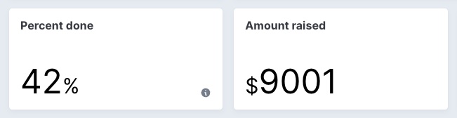
# Decorate the data using prefix and suffix
Some metrics might want to add a prefix or a suffix to display the data better.
class UsersMetric < Avo::Dashboards::MetricCard
  self.id = 'users_metric'
  self.prefix = '$'
  self.suffix = '%'
end
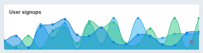
# Chartkick card
A picture is worth a thousand words. So maybe a chart a hundred? Who knows? But creating charts in Avo is very easy with the help of the chartkick (opens new window) gem.
You start by running bin/rails g avo:card:chartkick users_chart.
class UserSignups < Avo::Dashboards::ChartkickCard
  self.id = 'user_signups'
  self.label = 'User signups'
  self.chart_type = :area_chart
  self.description = 'Some tiny description'
  self.cols = 2
  # self.rows = 1
  # self.chart_options = { library: { plugins: { legend: { display: true } } } }
  # self.flush = true
  # self.legend = false
  # self.scale = false
  # self.legend_on_left = false
  # self.legend_on_right = false

  def query
    points = 16
    i = Time.new.year.to_i - points
    base_data =
      Array
        .new(points)
        .map do
          i += 1
          [i.to_s, rand(0..20)]
        end
        .to_h

    data = [
      { name: 'batch 1', data: base_data.map { |k, v| [k, rand(0..20)] }.to_h },
      { name: 'batch 2', data: base_data.map { |k, v| [k, rand(0..40)] }.to_h },
      { name: 'batch 3', data: base_data.map { |k, v| [k, rand(0..10)] }.to_h }
    ]

    result data
  end
end
# Chart types
Using the self.chart_type class attribute you can change the type of the chart. Supported types are line_chart, pie_chart, column_chart, bar_chart, area_chart, and scatter_chart.
# Customize chart
Because the charts are being rendered with padding initially, we offset that before rendering to make the chart look good on the card. To disable that, you can set self.flush = false. That will set the chart loose for you to customize further.
After you set flush to false, you can add/remove the scale and legend. You can also place the legend on the left or right using legend_on_left and legend_on_right.
These are just some of the predefined options we provide out of the box, but you can send different chartkick options (opens new window) to the chart using chart_options.
If you'd like to use Groupdate (opens new window), Hightop (opens new window), and ActiveMedian (opens new window) you should require them in your Gemfile. Only chartkick is required by default.
chart.js is supported for the time being. So if you need support for other types, please reach out or post a PR (🙏 PR's are much appreciated).
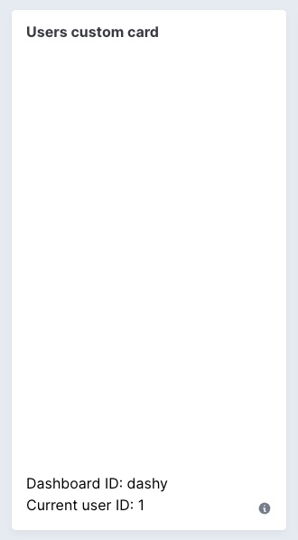
# Partial card
You might want to add your own custom content to a card. You can do that using a partial card. You generate one by running bin/rails g avo:card:partial custom_card. That will create the card class and the partial for it.
class ExampleCustomPartial < Avo::Dashboards::PartialCard
  self.id = "users_custom_card"
  self.cols = 1
  self.rows = 4
  self.partial = "avo/cards/custom_card"
  # self.display_header = true
end
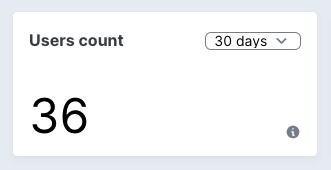
You may even embed a piece of content from another app using an iframe. You can hide the header using the self.display_header = false option. That will render the embedded content flush to the container.
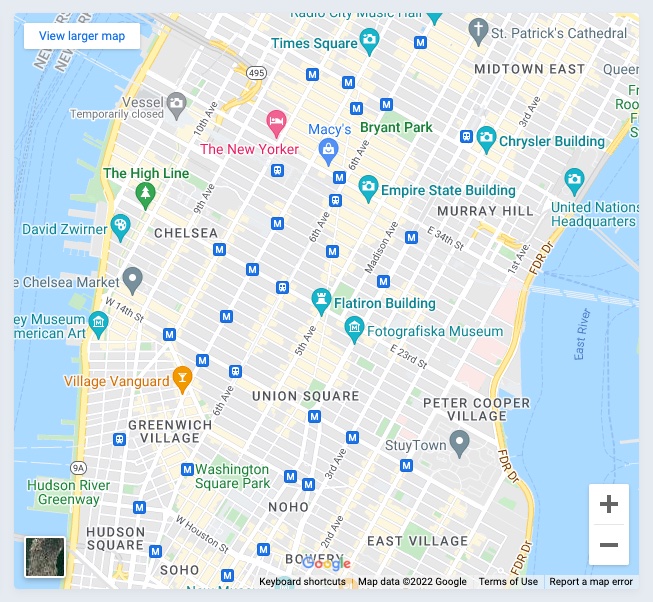
# app/avo/cards/map_card.rb
class MapCard < Avo::Dashboards::PartialCard
  self.id = "map_card"
  self.label = "Map card"
  self.partial = "avo/cards/map_card"
  self.display_header = false
  self.cols = 2
  self.rows = 4
end
<!-- app/views/avo/cards/_map_card.html.erb -->
<iframe src="https://www.google.com/maps/embed?pb=!1m14!1m12!1m3!1d17991.835132857846!2d-73.98926852562143!3d40.742050491245955!2m3!1f0!2f0!3f0!3m2!1i1024!2i768!4f13.1!5e0!3m2!1sen!2sro!4v1647079626880!5m2!1sen!2sro" width="100%" height="100%" style="border:0;" allowfullscreen="" loading="lazy"></iframe>
# Dividers
You may want to separate the cards. You can use dividers to do that.
class Dashy < Avo::Dashboards::BaseDashboard
  self.id = 'dashy'
  self.name = 'Dashy'
  self.description = 'The first dashbaord'
  self.grid_cols = 3

  card ExampleMetric
  card ExampleAreaChart
  card ExampleScatterChart
  card PercentDone
  card AmountRaised
  card ExampleLineChart
  card ExampleColumnChart
  card ExamplePieChart
  card ExampleBarChart
  divider label: "Custom partials"
  card ExampleCustomPartial
  card MapCard
end
Dividers can be a simple line between your cards or have some text on them that you control using the label option.
When you don't want to show even the line, you can enable the invisible option, which adds the divider but does not display a border or label.
# Dashboards visibility
You might want to hide certain dashboards from certain users. You can do that using the visible option. The option can be a boolean true/false or a block where you have access to the params, current_user, context, and dashboard.
By default if you don't pass anything to visible, the dashboard will be available for anyone.
class ComplexDash < Avo::Dashboards::BaseDashboard
  self.id = "complex_dash"
  self.name = "Complex dash"
  self.description = "Complex dash description"
  self.visible = -> do
    current_user.is_admin?
    # or
    params[:something] == 'something else'
    # or
    context[:your_param] == params[:something_else]
  end

  card UsersCount
end