# Fields
# Badge
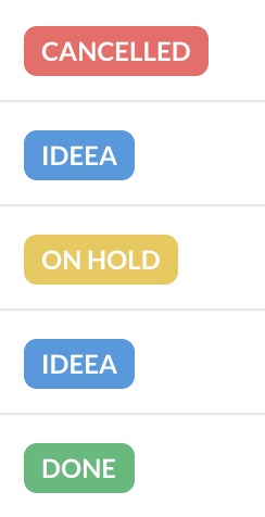
The Badge field is used to display an easily recognizable status of a record in the database.
field :stage, as: :badge, options: { info: [:discovery, :idea], success: :done, warning: 'on hold', danger: :cancelled } # The mapping of custom values to badge values.
By default, the badge field supports four value types: info (blue), success (green), danger (red) and warning (yellow). We can choose what database values are mapped to which type with the options parameter.
The options parameter is a Hash the has the state as the key and your configured values as value. The value param can be a symbol, string, or array of symbols or strings.
The Badge field is intended to be displayed only on Index and Show views. In order to update the value shown by badge field you need to use another field like Text or Select, in combination with hide_on: index and hide_on: show.
Below is an example on how you can use two fields in that combination.
field :stage, as: :select, hide_on: [:show, :index], options: { 'Discovery': :discovery, 'Idea': :idea, 'Done': :done, 'On hold': 'on hold', 'Cancelled': :cancelled }, placeholder: 'Choose the stage.'
field :stage, as: :badge, options: { info: [:discovery, :idea], success: :done, warning: 'on hold', danger: :cancelled }
# Boolean
The Boolean field renders a input[type="checkbox"] on Form views and a nice green check icon/red X icon on the Show and Index views.

field :is_published, as: :boolean, name: 'Published', true_value: 'yes', false_value: 'no',
You might not use true/false or 1/0 to store the value in the database. By using true_value and false_value, you may declare different values for that database field like yes/no.
# Boolean Group
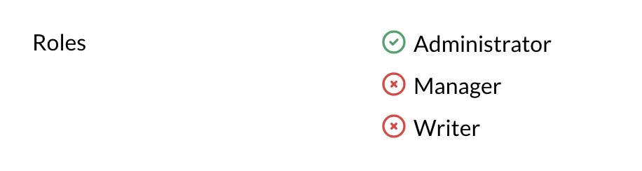
The BooleanGroup is used to update a Hash with string keys and boolean values in the database.
field :roles, as: :boolean_group, name: 'User roles', options: { admin: 'Administrator', manager: 'Manager', writer: 'Writer' }
It's useful when you want have something like a roles hash in your database.
# Example boolean group hash stored in the database
{
  admin: true,
  manager: true,
  creator: true,
}
# Code
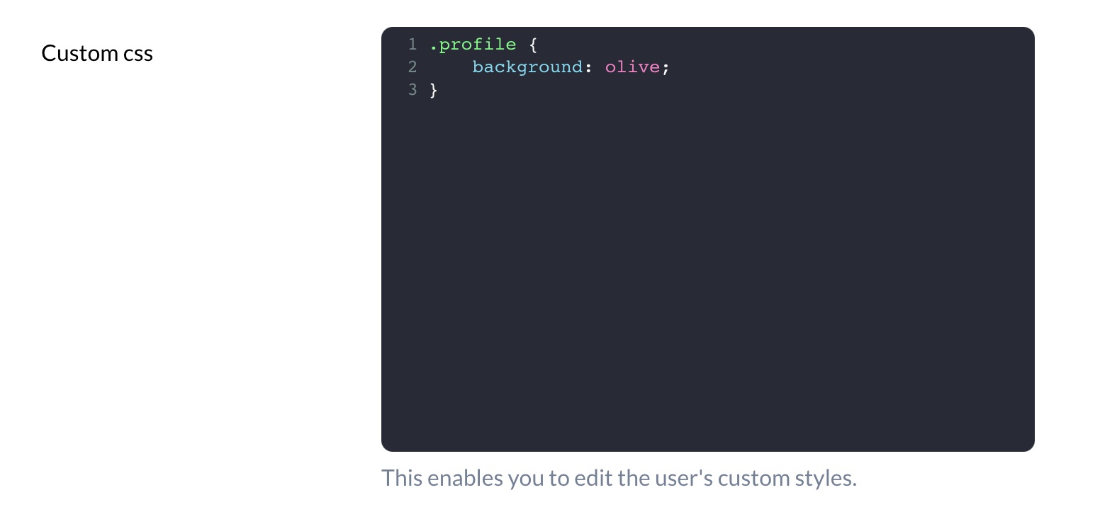
The Code field generates a code editor using codemirror (opens new window) package. This field is hidden on Index view.
field :custom_css, as: :code, theme: 'dracula', language: 'css'
# Customize Theme
You can customize the theme of the Code field using the theme option. It defaults to material-darker, but you can choose from material-darker, eclipse, dracula. You can preview the themes here: codemirror-themes (opens new window).
# Customize Syntax Highlighting
You can customize the programming language highlighting of the Code field using the language method. It defaults to javascript but you can choose from css, dockerfile, htmlmixed, javascript, markdown, nginx, php, ruby, sass, shell, sql, vue or xml.
# Country
Country field generates a Select field on Edit view that includes all ISO 3166-1 (opens new window) countries. The value stored in the database is going to be the country code, and the value displayed in Avo is going to be the name of the country.
You can easily choose to display the name of the countries in Index and Show views by declaring display_name to true.
field :country, as: :country, display_name: true
# Date
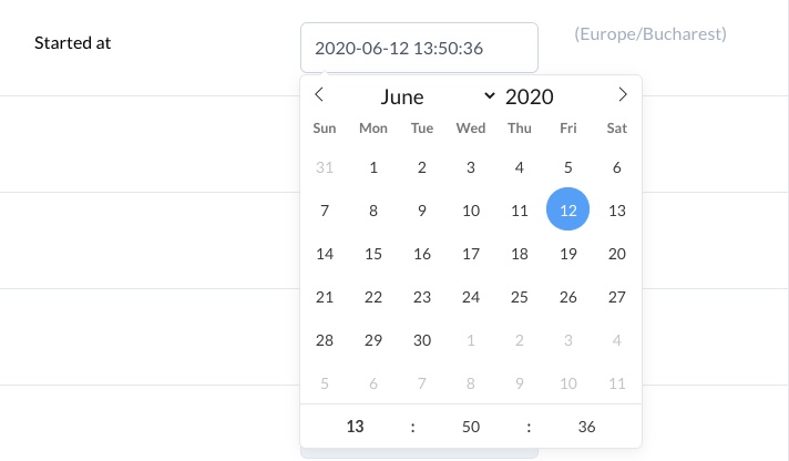
The Date field may be used to display date values.
For the Index and Show views you should use ruby date format (opens new window) or Time::DATE_FORMATS (opens new window) tokens.
The Edit view of the picker is using flatpickr (opens new window). You may use the formatting tokens (opens new window) to format the date.
You may also pass the first_day_of_week attribute to have that reflected on the generated calendar component. 1 is Monday (default), and 7 is Sunday.
field :birthday, as: :date, first_day_of_week: 1, picker_format: 'F J Y', format: '%Y-%m-%d', placeholder: 'Feb 24th 1955'
If you'd like to show the time relative to the present (4 months ago, in 3 years, etc.) use the relative: true option.
field :valid_until, as: :date, relative: true
# Mobile date picker
By default, flatpickr is disabled on mobile (opens new window) because the mobile date pickers tend to give a better experience, but you can override that using disable_mobile: true. That option will override that behavior and display flatpickr on mobile devices too. The same applies to the date_time field too.
# DateTime
The DateTime field is similar to the Date field with two new attributes. time_24hr tells flatpickr to use 24 hours format and timezone to tell it in what timezone to display the time. By default it uses your browser's timezone.
filed :created_at, as: :date_time, name: 'User joined', picker_format: 'Y-m-d H:i', format: :db, time_24hr: true, timezone: 'PST'
# External image
You may have a field in the database that holds the url to an image and you want to display that in Avo. This is where the ExternalImage field comes in to help.
It will take the value and insert it into an image_tag.
field :logo, as: :external_image
It takes three options :width, :height and :radius that get used to show the image on the Index view.
You may also pass in a computed value or pass it as the grid :cover position.
cover :logo, as: :external_image, link_to_resource: true do |model|
  if model.url.present?
    "//logo.clearbit.com/#{URI.parse(model.url).host}?size=180"
  end
end
# File
The File field may be used to attach files using Active Storage (opens new window). Avo will use your application's Active Storage settings. You may use whichever supported disk services (opens new window).
field :avatar, as: :file, is_image: true
# Display the file as image
The is_image option renders the file as an image instead of rendering the file name.
# Display the file as an audio file
The is_audio option renders an audio player that allows you to play the file.
# Display the file as an video file
The is_video option renders an video player that allows you to play the file.
# Direct upload support
If you have large files and you don't want to overload the server with uploads you can use the direct_upload feature which will upload the file directly to your cloud provider.
field :cover_video, as: :file, direct_upload: true
# Accept option
You can instruct the browser to accept only a certain type of files in the field input using the accept option.
field :cover_video, as: :file, accept: "image/*"
# Authorization
upload_attachments?, delete_attachments? and download_attachments? methods set on your model's pundit policy. Otherwise the input and download/delete button will not be shown.
# Files
The Files field is similar to File and enables you to upload multiple files at once using Active Storage (opens new window).
field :documents, as: :files
# Direct upload support
If you have large files and you don't want to overload the server with uploads you can use the direct_upload feature which will upload the file directly to your cloud provider.
field :files, as: :files, direct_upload: true
# Gravatar
The Gravatar field should be linked to an email field from the database, displaying the avatar image assigned to that email address in the Gravatar (opens new window) database. By default, it uses the email field, but if the email address is stored in another column, you can specify that column.
field :email, as: :gravatar, rounded: false, size: 60, default_url: 'some image url'
You may also pass in a computed value.
field :email, as: :gravatar do |model|
  "#{model.google_username}@gmail.com"
end
# Customization
On Index, by default, the image is rounded and has size of 40 px, but it can be changed by setting rounded to false and by specifying the size (in pixels) in field declaration.
On Show, the image is always squared and the size is responsive.
You can customize the image shown when gravatar is not found by changing the default_url attribute to a custom image URL.
# Heading
The Heading field is used to display a banner between fields, such as a separator for big lists or a header for different sections.
Heading is not assigned to any column in the database and only visible on Edit and Create views.
heading 'Address fields'
The as_html option will render it as HTML.
heading '<div class="underline text-gray-800 uppercase">Address fields</,div>', as_html: true
# Hidden
You might have a scenario where you need a value to update a model. You may use the Hidden field to add an input[type="hidden"] field to the Form views.
field :group_id, as: :hidden
# ID
The id field is used to show the record's id.
field :id, as: :id
This is a good field to add as_link_to_resource option to make it a shortcut to the resource Show page.
# KeyValue
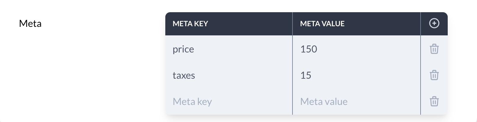
The KeyValue field allows you to edit flat key-value pairs stored in JSON format in the database.
field :meta, as: :key_value
# Customizing the labels
You can easily customize the labels displayed in the UI by mentioning custom values in key_label, value_label, action_text, and delete_text properties when defining the field.
field :meta, # The database field ID
  as: :key_value, # The field type.
  key_label: 'Meta key', # Custom value for key header. Defaults to 'Key'.
  value_label: 'Meta value', # Custom value for value header. Defaults to 'Value'.
  action_text: 'New item', # Custom value for button to add a row. Defaults to 'Add'.
  delete_text: 'Remove item' # Custom value for button to delete a row.. Defaults to 'Delete'.
# Enforce restrictions
You can enforce some restrictions by removing the ability to edit the field's key, by setting disable_editing_keys to true. Be aware that this option will also disable adding rows as well. You can separately remove the ability to add a new row by setting disable_adding_rows to true. Deletion of rows can be enforced by setting disable_deleting_rows to true.
field :meta, # The database field ID
  as: :key_value, # The field type.
  disable_editing_keys: false, # Option to disable the ability to edit keys. Implies disabling to add rows. Defaults to false.
  disable_adding_rows: false, # Option to disable the ability to add rows. Defaults to false.
  disable_deleting_rows: false # Option to disable the ability to delete rows. Defaults to false.
KeyValue is hidden on Index view.
# Markdown
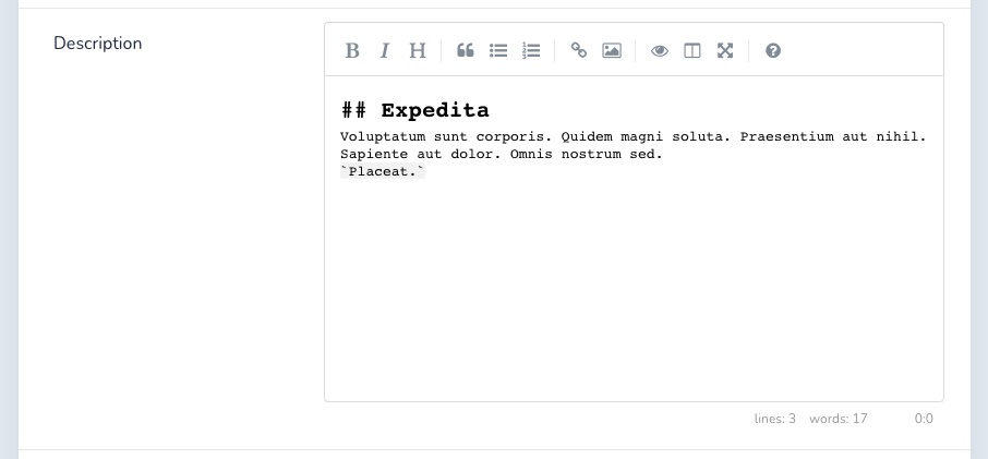
The Markdown field renders a SimpleMDE Markdown Editor (opens new window) and is associated to a text or textarea column in the database.
Markdown field converts text within the editor in raw Markdown text and stores it back to database.
Markdown field is hidden from the Index view. By default, the Markdown field is not directly shown to the user on the Show view, instead being hidden under a Show Content link, that displays the content. You can set Markdown to always display the content by setting always_show to true.
field :description, as: :markdown, always_show: true
# Enable spell checker
You can also enable the spell checker using the spell_checker: true option.
field :description, as: :markdown, spell_checker: true
# Number
The Number field renders a input[type="number"] element and has the min, max, and step options.
field :age, as: :number, min: 0, max: 120, step: 5
# Password
The Password field renders a input[type="password"] element for that field.
Password field is by default enforced to be shown only on Form views.
field :password, as: :password, placeholder: 'secret',
# Progress bar
The ProgressBar field renders a progress element on index and show views and and a input[type=range] element on forms.
field :progress, as: :progress_bar
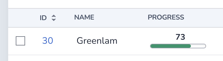
The field takes four options. The max option sets the maximum value and step for the stepping interval.
Using the display_value option you can choose to show the value above the progress bar. You can even add the % suffix using the value_suffix option.
field :progress, as: :progress_bar, max: 150, step: 10, display_value: true, value_suffix: "%"

# Select
The Select field renders a select field.
field :type, as: :select, options: { 'Large container': :large, 'Medium container': :medium, 'Tiny container': :tiny }, display_with_value: true, placeholder: 'Choose the type of the container.'
We can configure it using the options attribute, which is a Hash with the key as the label and the value as the database value.
On Index, Show and Edit views you may want to display the values and not the labels of the options. You may change that by setting display_value to true.
The Select field also supports Active Record enums (opens new window). For that to work you only need switch options with enum.
# app/models/project.rb
class Project < ApplicationRecord
  enum type: { 'Large container': 'large', 'Medium container': 'medium', 'Tiny container': 'small' }
end

# app/avo/resources/project_resource.rb
class ProjectResource < Avo::BaseResource
  field :type, as: :select, enum: ::Project.types, display_with_value: true, placeholder: 'Choose the type of the container.'
  # other fields go here
end
# Computed options
You may want to computed the values for your select field. You can use a lambda for that. That lambda gives you access to the model, resource, view, and field properties that you can pull data off.
# app/avo/resources/project_resource.rb
class ProjectResource < Avo::BaseResource
  field :type, as: :select, options: ->(model: model, resource: resource, view: view, field: field) { model.get_types_from_the_database.map { |type| [type.name, type.id] } }, placeholder: 'Choose the type of the container.'
end
The output value must be a supported options_for_select (opens new window) value.
# Include blank
The Select field also has the include_blank option. This can have three values.
If it's set to false (default) it will not show any blank option, but only the options you configured.
If it's set to true and you have a placeholder value assigned, it will use that placeholder string as the first option.
If it's a string include_blank: "No country", the No country string will appear as the first option in the <select> and it will set the value empty or nil depending on your settings.
# Status
The Status field is used to visually display the status of a column (loading or failed), supporting the following options:
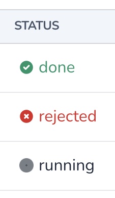
field :progress, as: :status, failed_when: ['closed', 'rejected', 'failed'], loading_when: ['loading', 'running', 'waiting', 'in progress']
You may customize the failed and loading states by using failed_when and loading_when. failed_when defaults to failed, while loading_when defaults to both waiting and running.
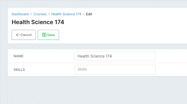
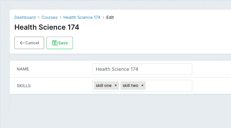
# Tags field
Requires v2.6.0
Adding a list of things to a record is something we need to do pretty frequently, that's why having the tags field is really useful.
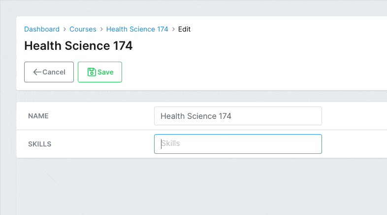
field :skills, as: :tags
# Suggestions
You can pass suggestions to your users to pick from. The suggestions option can be an array of strings, an object with the keys value, label, and (optionally) avatar, or a block that returns an array of that type of object. The block is a RecordHost, so it has access to the record.
# app/avo/resources/course_resource.rb
class CourseResource < Avo::BaseResource
  field :skills, as: :tags, suggestions: -> { record.skill_suggestions }
end

# app/models/course.rb
class Course < ApplicationRecord
  def skill_suggestions
    ['example suggestion', 'example tag', self.name]
  end
end
The suggestions will be displayed to the user as a dropdown under the field.
# Enforce suggestions
You might only want to allow the user to select from a pre-configured list of items. You can use enforce_suggestions to do that. Now the user won't be able to add anything else than what you posted in the suggestions option.
# app/avo/resources/course_resource.rb
class CourseResource < Avo::BaseResource
  field :skills, as: :tags, suggestions: %w(one two three), enforce_suggestions: true
end
# Disallowed
The disallowed param works similarly to suggestions. Use it to prevent the user from adding specific values.
# app/avo/resources/course_resource.rb
class CourseResource < Avo::BaseResource
  field :skills, as: :tags, disallowed: ['not', 'that']
end
# Delimiters
By default, the delimiter that cuts off the content when the user inputs data is a comma ,. You can customize that using the delimiters option.
# app/avo/resources/course_resource.rb
class CourseResource < Avo::BaseResource
  field :skills, as: :tags, delimiters: [',', ' ']
end

Valid values are comma , and space .
# Close on select
If you have suggestions enabled, the dropdown with the options will keep open after the user selects an option. You can choose to close it after a selection using close_on_select.
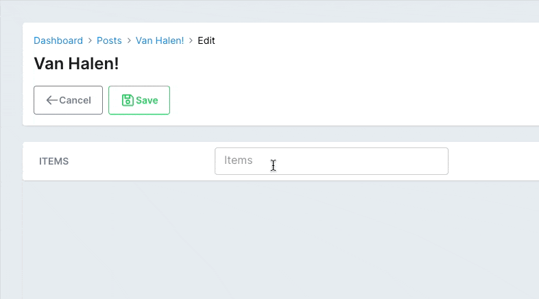
# app/avo/resources/post_resource.rb
class PostResource < Avo::BaseResource
  field :items, as: :tags, suggestions: -> { Post.tags_suggestions }, close_on_select: true
end

# app/models/post.rb
class Post < ApplicationRecord
  def self.tags_suggestions
    [
      {
        value: 1,
        label: 'one',
        avatar: 'https://images.unsplash.com/photo-1560363199-a1264d4ea5fc?ixlib=rb-1.2.1&ixid=MnwxMjA3fDB8MHxwaG90by1wYWdlfHx8fGVufDB8fHx8&auto=format&w=256&h=256&fit=crop',
      },
      {
        value: 2,
        label: 'two',
        avatar: 'https://images.unsplash.com/photo-1567254790685-6b6d6abe4689?ixlib=rb-1.2.1&ixid=MnwxMjA3fDB8MHxwaG90by1wYWdlfHx8fGVufDB8fHx8&auto=format&w=256&h=256&fit=crop',
      },
      {
        value: 3,
        label: 'three',
        avatar: 'https://images.unsplash.com/photo-1560765447-da05a55e72f8?ixlib=rb-1.2.1&ixid=MnwxMjA3fDB8MHxwaG90by1wYWdlfHx8fGVufDB8fHx8&auto=format&w=256&h=256&fit=crop',
      },
    ]
  end
end
# PostgreSQL array fields
You can use the tags field with the PostgreSQL array field.
# app/avo/resources/course_resource.rb
class CourseResource < Avo::BaseResource
  field :skills, as: :tags
end

# db/migrate/add_skills_to_courses.rb
class AddSkillsToCourses < ActiveRecord::Migration[6.0]
  def change
    add_column :courses, :skills, :text, array: true, default: []
  end
end
# Array fields
We haven't tested all the possibilities, but the tags field should play nicely with any array fields provided by Rails.
# app/avo/resources/post_resource.rb
class PostResource < Avo::BaseResource
  field :items, as: :tags
end

# app/models/post.rb
class Post < ApplicationRecord
  def items=(items)
    puts ["items->", items].inspect
  end

  def items
    %w(1 2 3 4)
  end
end
# Acts as taggable on
One very popular gem used for tagging is acts-as-taggable-on (opens new window). The tags field integrates very well with it.
You need to add gem 'acts-as-taggable-on', '~> 9.0' in your Gemfile, add it to your model acts_as_taggable_on :tags, and use acts_as_taggable_on on the field.
# app/avo/resources/post_resource.rb
class PostResource < Avo::BaseResource
  field :tags,
    as: :tags,
    acts_as_taggable_on: :tags,
    close_on_select: false,
    placeholder: 'add some tags',
    suggestions: -> { Post.tags_suggestions },
    enforce_suggestions: true,
    help: 'The only allowed values here are `one`, `two`, and `three`'
end

# app/models/post.rb
class Post < ApplicationRecord
  acts_as_taggable_on :tags
end
That will let Avo know which attribute should be used to fill with the user's tags.
# Text
The Text field renders a regular text input.
field :title, as: :text
# Display data as HTML
You may want to display some information as HTML. Maybe a link to another record.
You may use as_html: true attribute.
field :title, as: :text, as_html: true do |&args|
  '<a href="https://avohq.io">Avo</a>'
end
You may customize it with as many options as you need.
field :title, # The database field ID
  as: :text, # The field type
  name: 'Post title', # The label you want displayed
  required: true, # Display it as required
  readonly: true, # Display it disabled
  as_html: true # Should the output be parsed as html
  placeholder: 'My shiny new post', # Update the placeholder text
  format_using: -> (value) { value.truncate 3 } # Format the output
# Protocol
You may have fields that can be rendered better than just as text. For that Avo provides the protocol option that prepends what you give it to that field. For example you can make a text field a mailto link very quick.
field :email, as: :text, protocol: :mailto
# Textarea
The Textarea field renders a textarea element and has the rows option that controls how many rows it should render.
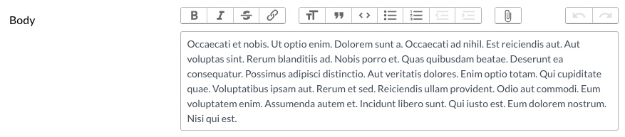
field :body, as: :textarea, rows: 5
# Trix
The Trix field renders a WYSIWYG Trix Editor (opens new window) and is associated to a string or text column in the database.
Trix field converts text within the editor in HTML and stores it back to database.
Trix field is hidden from Index view. By default, the Trix field is not directly visible to the user on the Show view, instead being hidden under a Show Content link, that triggers the visibility of the content. You can set Trix to always display the content by setting always_show to true.
field :body, as: :trix, always_show: true
# File attachments
Trix supports drag-and-drop file attachments. To enable Active Storage integration, you have to add the attachment_key option to your Trix field.
field :body, as: :trix, attachment_key: :trix_attachments
That attachment_key has to have the same name as on the model.
class Post < ApplicationRecord
  has_many_attached :trix_attachments
end
Now, when you upload a file in the Trix field, Avo will create an Active Record attachment.
# Disable attachments
You may want to use Trix only as a text editor and disable the attachments feature. Adding the attachments_disabled option will hide the attachments button (paperclip icon).
field :body, as: :trix, attachments_disabled: true
# Remove attachment attributes
When adding an attachment, by default, Trix will add some meta-data in the editor (filename, filesize, and url). You might not need those to be present in the document. You can hide them using hide_attachment_filename, hide_attachment_filesize, and hide_attachment_url.