# Menu editor
Available from v2.3.0
One common task you need to do is organize your sidebar resources into menus. You can easily do that using the menu editor in the initializer.
When you start with Avo, you'll get an auto-generated sidebar By default. That sidebar will contain all your resources, dashboards, and custom tools. To customize that menu, you have to add the main_menu key to your initializer.
# config/initializers/avo.rb
Avo.configure do |config|
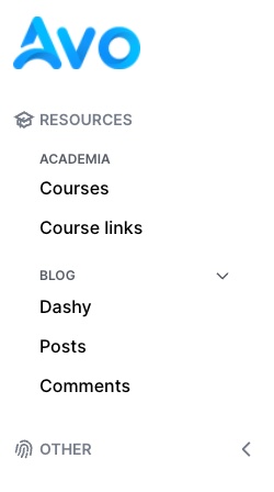
config.main_menu = -> {
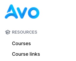
section "Resources", icon: "heroicons/outline/academic-cap" do
group "Academia" do
resource :course
resource :course_link
end
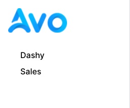
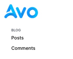
group "Blog", collapsable: true, collapsed: true do
dashboard :dashy
resource :post
resource :comment
end
end
section I18n.t('avo.other'), icon: "heroicons/outline/finger-print", collapsable: true, collapsed: true do
link 'Avo HQ', path: 'https://avohq.io', target: :_blank
link 'Jumpstart Rails', path: 'https://jumpstartrails.com/', target: :_blank
end
}
end
For now, Avo supports editing only two menus, main_menu and profile_menu. However, that might change in the future by allowing you to write custom menus for other parts of your app.
# config/initializers/avo.rb
Avo.configure do |config|
config.main_menu = -> {
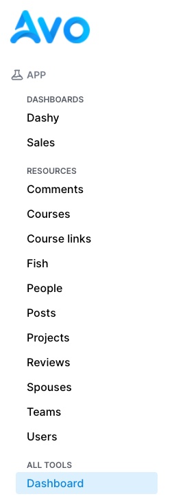
section I18n.t("avo.dashboards"), icon: "dashboards" do
dashboard :dashy, visible: -> { true }
dashboard :sales, visible: -> { true }
group "All dashboards", visible: false do
all_dashboards
end
end
section "Resources", icon: "heroicons/outline/academic-cap" do
group "Academia" do
resource :course
resource :course_link
end
group "Blog" do
resource :posts
resource :comments
end
group "Other" do
resource :fish
end
end
section "Tools", icon: "heroicons/outline/finger-print" do
all_tools
end
group do
link "Avo", path: "https://avohq.io"
link "Google", path: "https://google.com", target: :_blank
end
}
config.profile_menu = -> {
link "Profile", path: "/profile", icon: "user-circle"
}
end
# Menu item types
A few menu item types are supported link, section, group, resource, and dashboard. There are a few helpers too, like all_resources, all_dashboards, and all_tools.
# Link
Link is the menu item that the user will probably interact with the most. It will generate a link on your menu. You can specify the name, path , and target.
link "Google", path: "https://google.com", target: :_blank
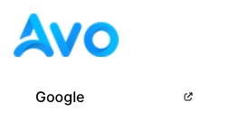
When you add the target: :_blank option, a tiny external link icon will be displayed.
# Resource
To make it a bit easier, you can use resource to quickly generate a link to one of your resources. For example, you can pass a short symbol name :user or the full name UserResource.
resource :posts
resource "CommentsResource"
You can also change the label for the resource items to something else.
resource :posts, label: "News posts"
# Dashboard
Similar to resource, this is a helper to make it easier to reference a dashboard. You pass in the id or the name of the dashboard.
dashboard :dashy
dashboard "Sales"
You can also change the label for the dashboard items to something else.
dashboard :dashy, label: "Dashy Dashboard"
# Section
Sections are the big categories in which you can group your menu items. They take name and icon options.
section "Resources", icon: "heroicons/outline/academic-cap" do
  resource :course
  resource :course_link
end
# Group
Groups are smaller categories where you can bring together your items.
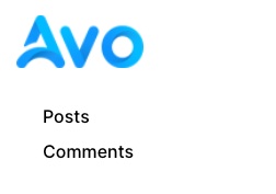
group "Blog" do
  resource :posts
  resource :categories
  resource :comments
end
# Item visibility
The visible option is avaialble on all menu item. It can be a boolean or a block that has access to a few things:
- the
current_user. Given that you set a way for Avo to know who the current user is, that will be available in that block call - the
contextobject. - the
paramsobject of that current request - the
view_context(opens new window) object. Theview_contextobject lets you use the route helpers. eg:view_context.main_app.posts_path.
# config/initializers/avo.rb
Avo.configure do |config|
  config.main_menu = -> {
    resource :user, visible: -> do
      context[:something] == :something_else
    end
  }
end
# Using authorization rules
When you switch from a generated menu to a custom one you might want to keep using the same authorization rules as before. To easily to that, use the authorize method in the visible option.
# config/initializers/avo.rb
Avo.configure do |config|
  config.main_menu = -> {
    resource :team, visible: -> do
      # authorize current_user, MODEL_THAT_NEEDS_TO_BE_AUTHORIZED, METHOD_THAT_NEEDS_TO_BE_AUTHORIZED
      authorize current_user, Team, "index?", raise_exception: false
    end
  }
end
# all_ helpers
We also added some helpers for the scenario where you want to customize part of a menu for convenience. For example, let's say you want to add some custom tools and mix and match the dashboards, but you don't want to disturb the resources. You can use all_resources to generate a list containing all of them.
section "App", icon: "heroicons/outline/beaker" do
  group "Dashboards", icon: "dashboards" do
    all_dashboards
  end

  group "Resources", icon: "resources" do
    all_resources
  end

  group "All tools", icon: "tools" do
    all_tools
  end
end
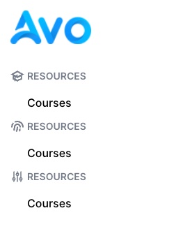
# Icons
For Sections, you can use icons to make them look better. You can use some local ones that we used throughout the app and all heroicons (opens new window) designed by Steve Schoger (opens new window). You can use the solid or outline versions. We used the outline version throughout the app.
section "Resources", icon: "heroicons/outline/academic-cap" do
  resource :course
end

section "Resources", icon: "heroicons/solid/finger-print" do
  resource :course
end

section "Resources", icon: "heroicons/outline/adjustments" do
  resource :course
end
# Collapsable sections and groups
When you have a lot of items they can take up a lot of vertical space. You can choose to make those sidebar sections collapsable by you or your users.
section "Resources", icon: "resources", collapsable: true do
  resource :course
end
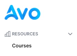
That will add the arrow icon next to the section to indicate it's collapsable. When your users collapse and expand it, their choice will be stored in Local Storage and remembered in that browser.
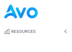
# Default collapsed state
You can, however set a default collapsed state using the collapsed option.
section "Resources", icon: "resources", collapsable: true, collapsed: true do
  resource :course
end
You might want to allow your users to hide certain items from view.
# Authorization
If you use the authorization feature, you will need an easy way to authorize your items in the menu builder.
For that scenario, we added the authorize helper.
Avo.configure do |config|
  config.main_menu = -> {
    resource :team, visible: -> {
      # authorize current_user, THE_RESOURCE_MODEL, THE_POLICY_METHOD, raise_exception: false
      authorize current_user, Team, "index?", raise_exception: false
    }
  }
end
Use it in the visible block by giving it the current_user (which is available in that block), the class of the resource, the method that you'd like to authorize for (default is index?), and tell it not to throw an exception.
Now, the item visibility will use the index? method from the TeamPolicy class.
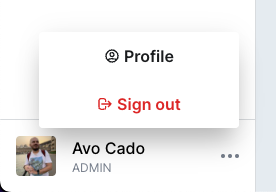
# Profile menu
The profile menu allows you to add items to the menu displayed in the profile component. The sign-out link is automatically added for you.
You may add the icon option to the profile_menu links.
# config/initializers/avo.rb
Avo.configure do |config|
  config.profile_menu = -> {
    link "Profile", path: "/profile", icon: "user-circle"
  }
end